Happy accidents. Exploring temporal type.
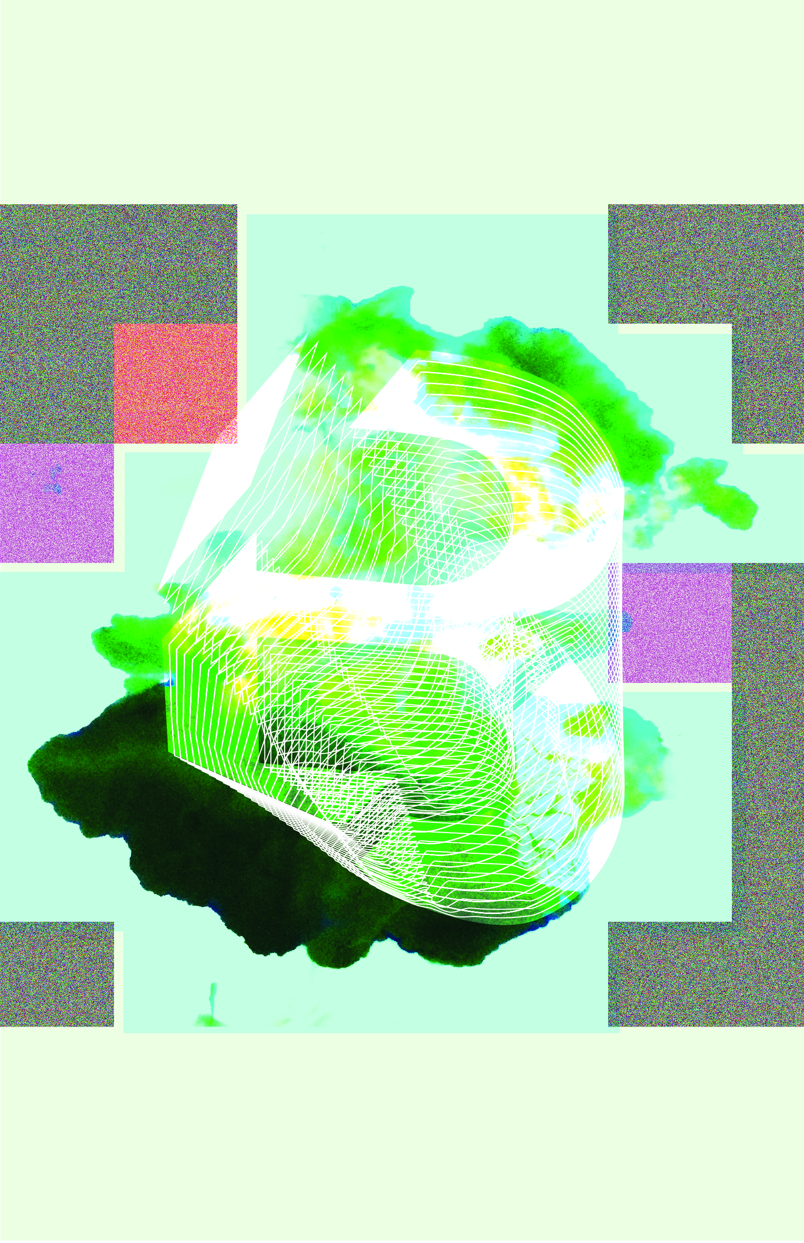
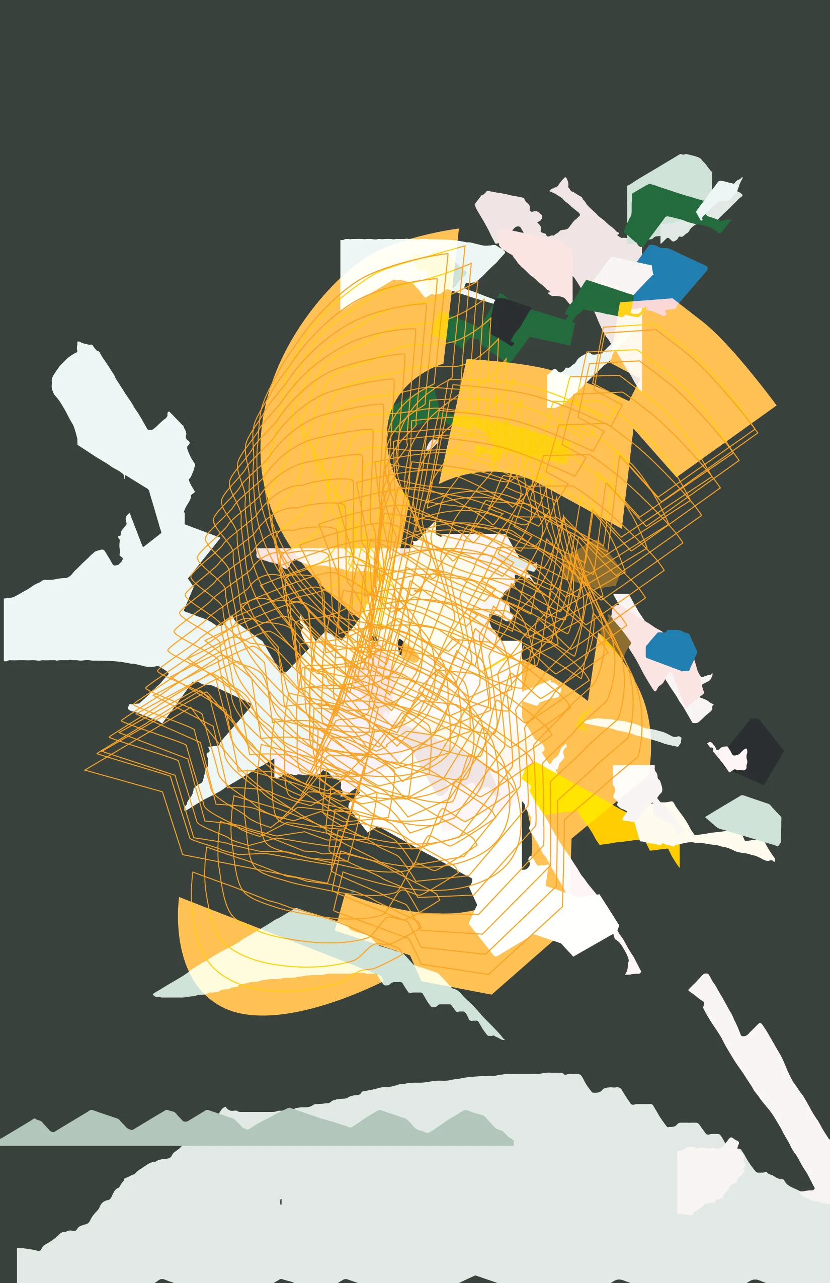
Glitch-glitchy
Letters are Beautiful
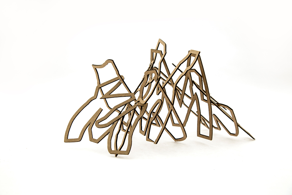
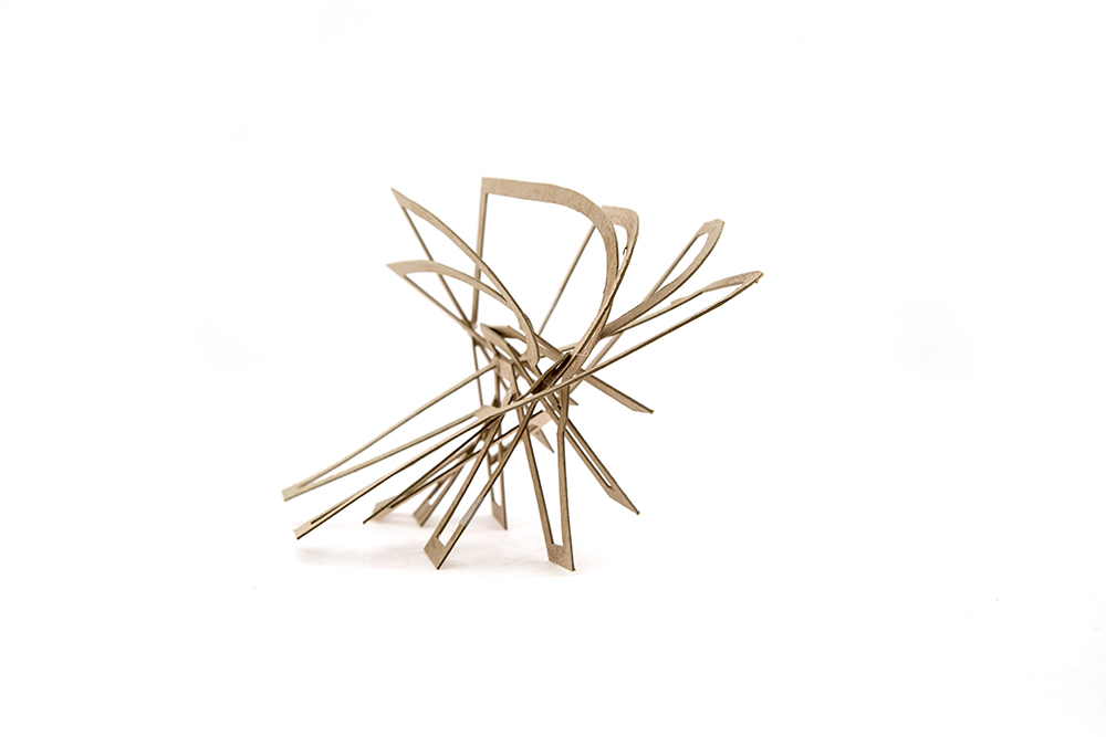
But aren't they? Studies of three dimensional, navigable, temporal typography.

Hack. Break. Misuse. Abuse. A Workshop with Keetra Dean Dixon
I had the pleasure of participating in a workshop lead by Keetra Dean Dixon this weekend at CCA. It was 12 hours of pure fun. Tools used were marshmallows, food coloring, Illustrator, scripts from JK Keller, and Photoshop.


Mistakes
Sometimes when you don't sleep enough, beautiful things happen.

Projection tests
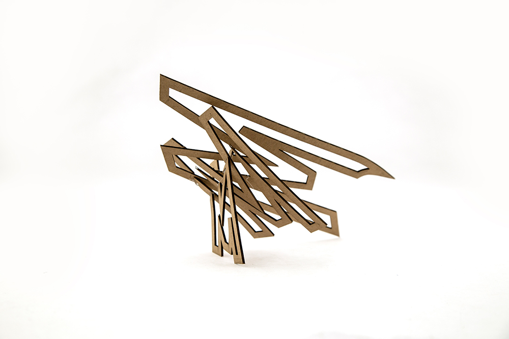
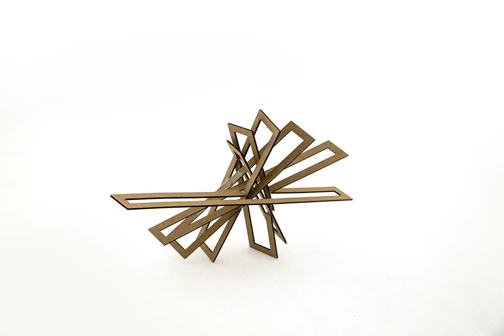
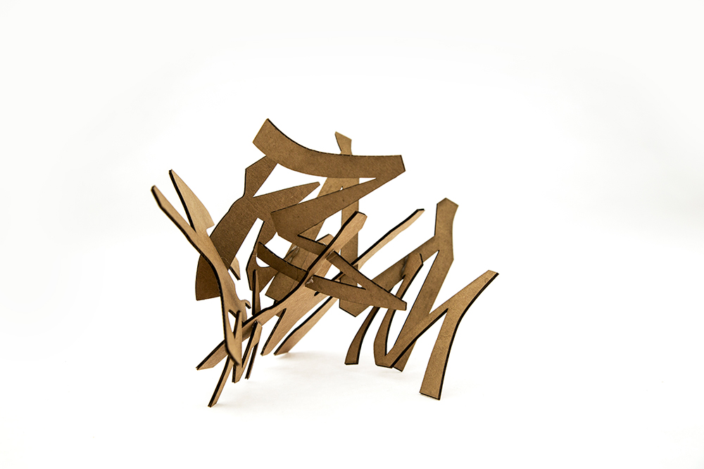
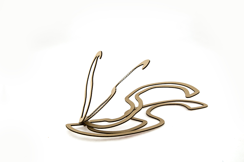
Examining the transitory, fluid nature of temporal type
Does legibility matter?
When dealing with fluidity in temporal typography, legibility is continually in flux. This means that legibility is a process that occurs (in various measure) as long as the form is mutating. Legibility assumes the viewer of the type is attempting to read, however, temporal type is less focused on readership and more focused on viewership.
Factors of viewership include perception and perspective. Perception is a constant fluctuation of past, present, and future form, requiring a continual rationalization about what is being seen. The perspective or viewpoint determines the angle at which the form is being seen. Due to the transitory nature of temporal typography, the perception and perspective of these forms may also be fluid.
So. The question of the week is whether legibility and readability are contributing factors or simply limitations of temporal typography?
